The Sheet Is an Interface
Everything a player does at the table passes through one page. Where the numbers sit determines how fast the game moves.
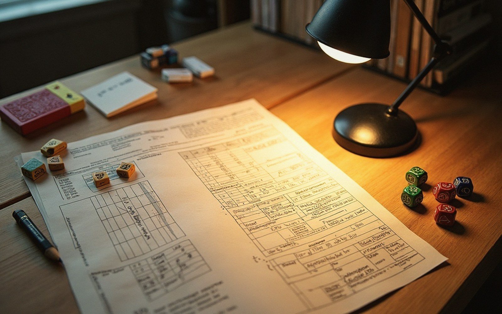
01The Page Is Not a Portrait
A character sheet is not a biography. It exists to be consulted under mild social pressure, in low light, while someone across the table is waiting. That constraint should drive every design decision about it — where things live, how large the boxes are, what order the sections appear in — and mostly it doesn't, because sheets are designed to look impressive rather than to be used.

The framing problem starts early. Most sheets open with identity: name, race, class, background, alignment, deity, age, height, weight, eye colour. This is the narrative halo, the part that makes the sheet feel like a character. It is also the part touched least often during play. Put it at the top and you push the mechanical meat — the numbers actually needed every thirty seconds — toward the bottom or the back, which is exactly where they shouldn't be.
The frequency hierarchy
- 01Reactive (consulted mid-action) — attack/skill modifier, relevant ability score, current hit points, AC
- 02Situational (checked when triggered) — spell slots, saving throws, special ability uses
- 03Static (written at creation, rarely consulted) — background, physical description, alignment, deity
The thing reached for constantly at most tables is the same short list: the attack bonus or skill modifier being rolled, the relevant ability score behind it, and the resource being spent or recovered. During combat, add armour class and hit points. If those five clusters are not immediately legible without scanning the whole page, the sheet is losing the table a few seconds on every single action. Across a four-hour session that compounds into minutes of dead air, and dead air at a table is where momentum goes to die.

02Grouping Is Argument
Every cluster of numbers on a sheet makes a claim about what belongs together. Ability scores beside their derived modifiers is an obvious pairing; ability scores at the top and their skill children scattered across a separate column is a layout that forces the eye to jump and rebuild the connection manually every time. The grouping either does that cognitive work in advance or it leaves it to the player on the spot.
Reading order matters for the same reason. The eye moves top-left to bottom-right in most Western page conventions — a sheet that fights that path will be fought in return. Frequent-use information belongs in the top third. The things written once and rarely consulted — backstory, spell descriptions, equipment weights — belong at the bottom or on a second page, not interrupting the hot zone. A well-designed sheet is almost a question of what earns that top real estate, resolved in advance by the designer so the player doesn't have to.
At the top: values consulted reactively, mid-action, often before the player has finished speaking the decision aloud.
White space is not waste. A box that is slightly too small for a real pencilled number forces abbreviation or cramped writing that becomes illegible by session three. The sheet gets erased and rewritten — especially hit points, spell slots, anything that tracks a resource in motion — and every erasure degrades the paper slightly. Generous boxes and heavier-weight stock are mechanical decisions as much as aesthetic ones, because a smeared, torn or pencil-shadowed box slows the lookup the sheet is supposed to serve.
Where layout decisions go wrong
- 01Identity block at top-left — prestige placement given to the least-used information
- 02Skill children separated from their parent ability scores — forces manual reconnection every lookup
- 03Boxes sized to look tidy rather than to hold a real pencilled number with erasure room
- 04Portrait box occupying prime real estate that reactive numbers could use
03The Hidden Rule of Lookup Speed
There is a quiet hierarchy to the numbers on any sheet. At the top: values consulted reactively, mid-action, often before the player has finished speaking the decision aloud. In the middle: values checked at the start of a scene or when a specific situation arises. At the bottom: values written at character creation and rarely touched again.
A sheet optimised for play maps that hierarchy onto physical space. The reactive numbers are large and anchored. The situational numbers are findable in a second or two. The static numbers can be small and tucked away, because nobody is hunting them under time pressure.

Where this breaks down — and it breaks down on nearly every commercial sheet ever printed — is that the hierarchy of use does not match the hierarchy of prestige. Designers give the most visible space to the things that feel most important thematically: the character's name rendered in a beautiful font, the class icon, the portrait box. These are the things that make a player feel seen. They are also almost entirely inert during play.
That tension between legibility and identity is real, and there is no clean answer to it. But a designer who understands it will at least make the trade consciously, rather than discovering at the table that everyone spends the first three minutes of every combat scanning the page for their own armour class.